
On This Page: [hide]
Today most of the websites use content management systems such as WordPress, Joomla, and OpenCart to be built and people tend to skip the essentials of the website creation process – the HTML and the CSS.
In the following article, we will guide you through the process of creating a responsive HTML5 and CSS3 website from scratch.
Building Website From Scratch HTML5 And CSS3
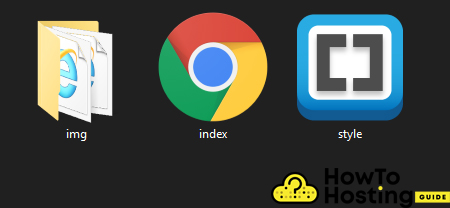
For the purpose of our tutorial, we will create 2 files – index.html and style.css and a folder that is going to store our images and we are going to name “img“.
The index.html file is where our HTML code is going to be. It is used for the “skeleton” of the website and it holds the main information about the website, the meta descriptions, the links to other files, and pretty much everything without stylings.
The style.css is the file that holds the styling of our page. It is going to be used for defining our styles, positioning, layouts, and the overall outlook of our website. For a better understanding of the structure of the code, we will break it down to pieces and explain every piece or line of code that you are going to use.
Every HTML5 document starts with the following lines of code:
<!DOCTYPE HTML>
<html lang=”en”>
<head>
<meta charset=”UTF-8″ />
<meta name=”viewport” content=”width=device-width, initial-scale=1.0″ />
<meta http-equiv=”X-UA-Compatible” content=”ie=edge” />
<link
href=”https://fonts.googleapis.com/css?family=Poppins:400,500&display=swap”
rel=”stylesheet”
/>
<link rel=”stylesheet” href=”./style.css” />
<title>Landing Page </title>
</head>
The <!DOCTYPE html> tells the browsers that this document is going to be using HTML5, the metacharset specifies the encoding of the document and we highly recommend keeping it to UTF-8. On some rare occasions if you are creating a website on a different language you might need to change that if you experience problems with displaying your language characters.
The meta name = “viewport” property tells the browser that the website is going to have a responsive behavior.
The link to google fonts lets your HTML document use google fonts for its texts and the link rel=” stylesheet” line of code links the style.css document to your HTML document, enabling you to apply the styles from your .css file straight to your HTML.
Body Of The HTML Website
The “body” of every HTML website, or <body> is where all of your content stays. The HTML <body> tag defines the main content of the HTML document or the section of the HTML document that will be visible on your web page when its opened.
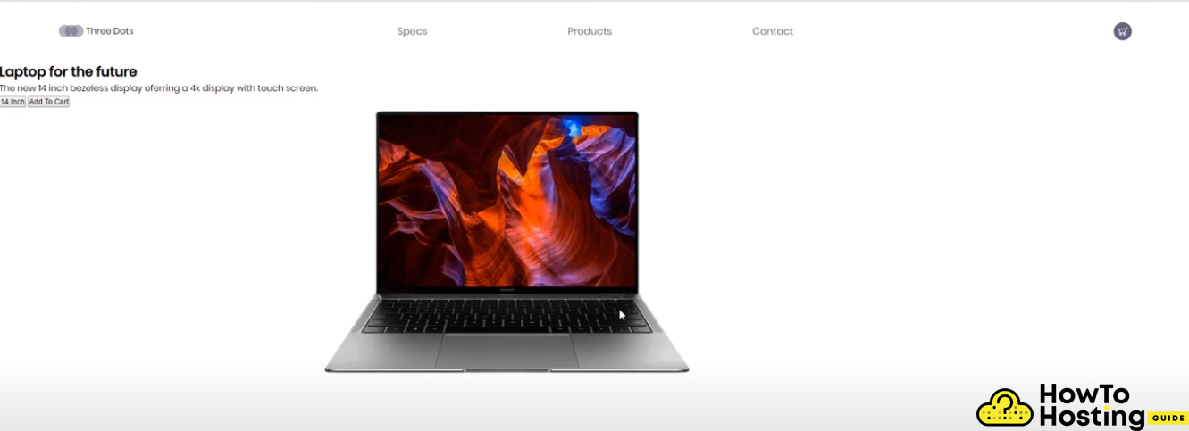
We will start our website by creating a body and including a header in it.
<body>
<header>
<div class=”logo-container”>
<img src=”./img/logo.svg” alt=”logo” />
< <h4 class=”logo”>Three Dots </h4>
</div>
<nav>
<ul class=”nav-links”>
<li> <a class=”nav-link” href=”#”>Specs</a></li>
<li> <a class=”nav-link” href=”#”>Products</a></li>
<li> <a class=”nav-link” href=”#”>Contact</a></li>
</ul>
</nav>
<div class=”cart”>
<img src=”./img/cart.svg” alt=”cart” />
</div>
</header <
This is the skeleton for our header and it includes an <header< which is the tag that is used for the header of every website. It holds the top of the website with its navigation.
Before proceeding, let’s take a minute to explain what a CSS class means.
What is a CSS Class?
A CSS class is a group of elements that share the same attributes, such as color or font-size. These attributes are specified to the class and can be applied to different elements. For example, we have a class “nav-link” that we use for every element in our menu and thus every navigation link in our menu will look and behave like every other navigation link that has that class on it.
We’ve included our logo within a div, that has a class “logo-container“.
An <h4> (meaning Heading 4) with a class of “logo” and a div with a class of “cart” that will be used for displaying the cart image.
Building The Main
<main>
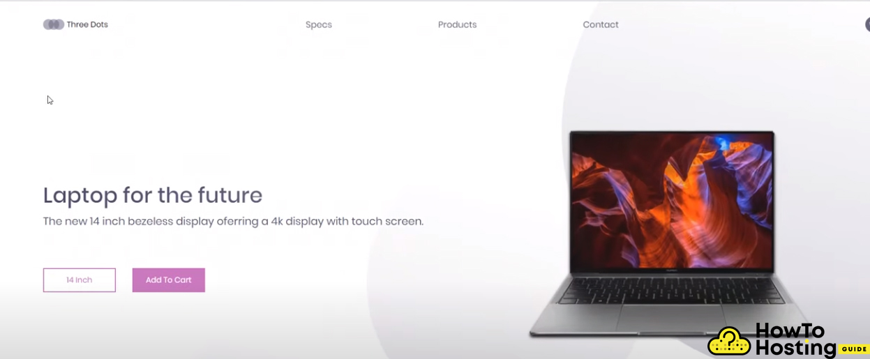
<section class=”presentation”>
<div class=”introduction”>
<div class=”intro-text”>
<h1>Laptop for the future</h1>
<p>
The new 14 inch bezeless display oferring a 4k
display with touch screen.
</p>
</div>
<div class=”cta”>
<button class=”cta-select”>14 Inch</button>
<button class=”cta-add”>Add To Cart</button>
</div>
</div>
<div class=”cover”>
<img src=”./img/matebook.png” alt=”matebook” />
</div>
</section>
<div class=”laptop-select”>
<img src=”./img/arrow-left.svg” alt=”” />
<img src=”./img/dot.svg” alt=”” />
<img src=”./img/dot-full.svg” alt=”” />
<img src=”./img/dot-full.svg” alt=”” />
<img src=”./img/arrow-right.svg” alt=”” />
</div>
<img class=”big-circle” src=”./img/big-eclipse.svg” alt=”” />
<img class=”medium-circle” src=”./img/mid-eclipse.svg” alt=”” />
<img class=”small-circle” src=”./img/small-eclipse.svg” alt=”” />
</main>
</body>
</html>
The <main></main> tag specifies the main content of our document. This element should be unique to the element and it should not contain any repeated content such as sidebars, navigation, logos, and search forms.
In our <main> </main> we have a <section> with a class named
“presentation“, a div with a class “introduction“, a div with another class <“intro-text”> and Heading 1 <h1> and a paragraph <p>. The classes are going to apply different styles for our elements. (more about that in the CSS part of the article).
The <img> tags are used for linking and displaying images, and we also added them some CSS class styling.
Once we are done with that, we are ready with the skeleton of our website. However, our website will now look very bad because it does not have its stylings done.
Styling Our Website
All of the stylings of our website are being written and saved in the style.css file. This file is a .css file that stores only CSS code and defines the visual part of our HTML layout, elements, classes, and ids.
The first thing that we wanna do in our styles.css file is to write down:
* {
margin: 0px;
padding: 0px;
box-sizing: border-box;
}
These lines of code are used to fix any margin or padding problems, and border-box as well. Once you’ve done that step, you can proceed with the styling of our <header>. To select the <headergt; element, simply use the
header
{
code
here
} ;
For our tutorial we will use
header {
display: flex;
width: 90%;
height: 10vh;
margin: auto;
align-items: center;
}
The display: flex property will move everything in one line.
The width:90% will make our header element to take 90% of the total width of our body. The margin: auto will figure out the proper space between the element and its parent container and adjust its position perfectly. The align-items: the center will position all of the child items that are in our <headergt; in its center.
Logo container, nav links, and cart
CSS is a very flexible and powerful language and it allows us to apply stylings to more than 1 class of elements. For example, we can apply the display: flex property to our logo-container, nav-links, and cart classes with a single line of code:
logo-container,
.nav-links,
.cart {
display: flex;
}
The display:flex property will take all of the available space of that 90% width.
.logo-container {
flex: 1;
}
.logo {
font-weight: 400;
margin: 5px;
}
nav {
flex: 2;
}
.nav-links {
justify-content: space-around;
list-style: none;
}
.nav-link {
color: #teal;
font-size: 18px;
text-decoration: none;
}
.cart {
flex: 1;
justify-content: flex-end;
}
These lines of CSS will grant some stylings to the .nav-link class, making the navigation color to teal, with larger font-size, remove the underline, increase the logo font-size to 400.
The justify-content: flex and will move the cart image to the end of its container and you are done with your header.
Proceeding with the styling of our presentation and introduction classes.
.presentation {
display: flex;
width: 90%;
margin: auto;
min-height: 80vh;
align-items: center;
}
.introduction {
flex: 1;
}
That will allow us to display the items flexed and position them side by side. We can then proceed with styling the intro-text h1, settings its font-size, font-weight, and giving it a background of a gradient as well.
.intro-text h1 {
font-size: 44px;
font-weight: 500;
background: linear-gradient(to right, #494964, #6f6f89);
-webkit-background-clip: text;
-webkit-text-fill-color: transparent;
}
.intro-text p {
margin-top: 5px;
font-size: 22px;
color: #585772;
}
This will apply stylings to the text h1 and text paragraphs as well, giving them some margin and a font-size of 22px as well as a #585772 color.
Styling the Call To Actions
.cta {
padding: 50px 0px 0px 0px;
}
.cta-select {
border: 2px solid #c36cbb;
background: transparent;
color: #c36cbb;
width: 150px;
height: 50px;
cursor: pointer;
font-size: 16px;
}
.cta-add {
background: #c36cbb;
width: 150px;
height: 50px;
cursor: pointer;
font-size: 16px;
border: none;
color: white;
margin: 30px 0px 0px 30px;
}
These lines of code will select the .cta elements and will give them proper stylings as well, changing the width, height, border, cursor, color, etc. The margin option will give some spacing away from the button from its top, right, bottom, left.
Once we get to this point our website already starts to look good.
Styling The Cover Image
.cover {
flex: 1;
display: flex;
justify-content: center;
height: 60vh;
}
.cover img {
height: 100%;
filter: drop-shadow(0px 5px 3px black);
animation: drop 1.5s ease;
}
These lines of CSS will make our laptop fit in the center of its container and also give it some shadow and a popup animation.
Positioning Background Circles
We want to put our circle images in the background of our page, so we can use the following CSS code:
.big-circle {
position: absolute;
top: 0px;
right: 0px;
z-index: -1;
opacity: 0.5;
height: 80%;
}
.medium-circle {
position: absolute;
top: 30%;
right: 30%;
z-index: -1;
height: 60%;
opacity: 0.4;
}
.small-circle {
position: absolute;
bottom: 0%;
left: 20%;
z-index: -1;
}
This will let us put the circles in the background with different positions and reduced opacity, so our page will look much better and much more professional.
Styling the Arrows
For the styling of our arrows, we will use
.laptop-select {
width: 15%;
display: flex;
justify-content: space-around;
position: absolute;
right: 20%;
}
Giving them a width of 15% of their container, display: flex, position absolute so we can position them where ever we want and right of 20%, sending them to the right side of our page.
Creating Animations
We will create a simple animation with the help of @keyframes.
@keyframes drop {
0% {
opacity: 0;
transform: translateY(-80px);
}
100% {
opacity: 1;
transform: translateY(0px);
}
}
Our code starts with an opacity of 0, or not being visible and start from a bit up, let’s say -80px, and when the animation finishes we want our animation to go to 0px. This will create a very nice and beautiful effect on our laptop when our page loads.
Making Our Website Mobile Friendly
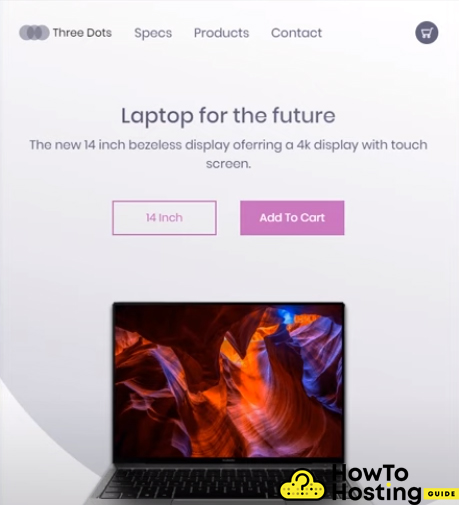
What we’ve created for now is a decent looking page that fits a laptop or a desktop user, but this will not look good on mobile devices.
To do that, we should use the media queries provided by the CSS and write down some rules, that will be applied depending on the screen size of our device.
Starting with a
@media screen and (max-width: 1024px) {
.presentation {
flex-direction: column;
}
the max-width:1024 property defines where the following rules should be applied. In other words, when the screen size becomes smaller than 1024px, the new set of rules will be applied and the website will change its look.
The flex-direction: the column will apply to the class .presentation and thus it will be position its elements 1 under another.
Then, we can proceed with applying some more rules under our
@media screen and (max-width: 1024px) {
.introduction {
margin-top: 5vh;
text-align: center;
}
.intro-text h1 {
font-size: 30px;
}
.intro-text p {
font-size: 18px;
}
.cta {
padding: 10px 0px 0px 0px;
}
.laptop-select {
bottom: 5%;
right: 50%;
width: 50%;
transform: translate(50%, 5%);
}
.cover img {
height: 80%;
}
.small-circle,
.medium-circle,
.big-circle {
opacity: 0.2;
}
}
}
These stylings will transform your website’s layout to fully responsive and give it its completed look.
Our Conclusion
Building a website from scratch is not that hard as long as you understand the way HTML and CSS work together.
Creating HTML elements and styling them with CSS selectors is a crucial knowledge that you should possess if you are about to start building websites.
Also Check: 16 Steps How to Create Small WordPress Website for Free
Also Read: How to Create a Blog on WordPress – Demo/Steps Tour (Update 2020)